
Discover the perfect color palette for your bedroom to create a relaxing retreat. Explore calming shades, design tips, and expert advice to style your sanctuary with ease.
Introduction
Your bedroom is more than just a place to sleep—it’s your personal sanctuary. Whether you’re escaping the chaos of a busy day or looking for a space to unwind, the right color palette for a bedroom can make all the difference. A thoughtfully chosen palette not only enhances aesthetics but also fosters a sense of calm and relaxation.
In this guide, we’ll explore soothing color combinations, offer actionable tips to incorporate them, and inspire you to design a restful retreat that feels as good as it looks.
Why Bedroom Color Matters
The psychology of color plays a vital role in creating a peaceful atmosphere. Bedrooms are spaces for rejuvenation, and certain hues have a natural calming effect, promoting better rest and relaxation. Soft neutrals, cool tones, and muted shades tend to work best for a tranquil setting.
When considering a color palette for a bedroom, aim for tones that reflect serenity and personal comfort. Whether you gravitate towards muted blues, earthy greens, or warm neutrals, your color choices influence the ambiance. 
4 Calming Color Palettes for a Relaxing Bedroom Retreat
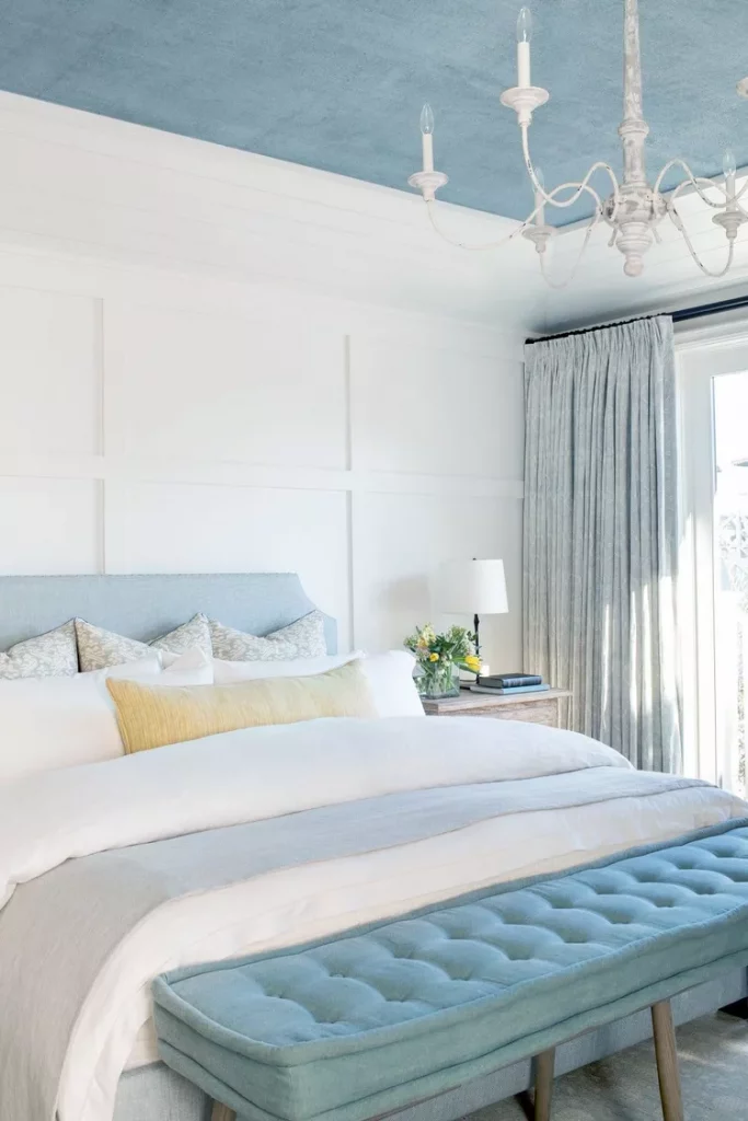
Soft Blues and Whites: A Coastal Haven
Inspired by serene seascapes, a combination of soft blue and crisp white is a timeless choice. This pairing evokes a clean, airy feel while maintaining a sense of calm.
Primary Palette: Sky blue, powder blue, and cool whites.
How to Use It: Paint your walls in a soft blue hue and complement with white bedding and light wood furniture. Add subtle blue accessories like throws or decorative cushions for cohesion.
Why It Works: Blue has been proven to lower heart rates and reduce stress, making it ideal for a bedroom retreat.
Pro Tip: Introduce textures like linen curtains or a woven rug to soften the space and add dimension.
Source: The Spruce
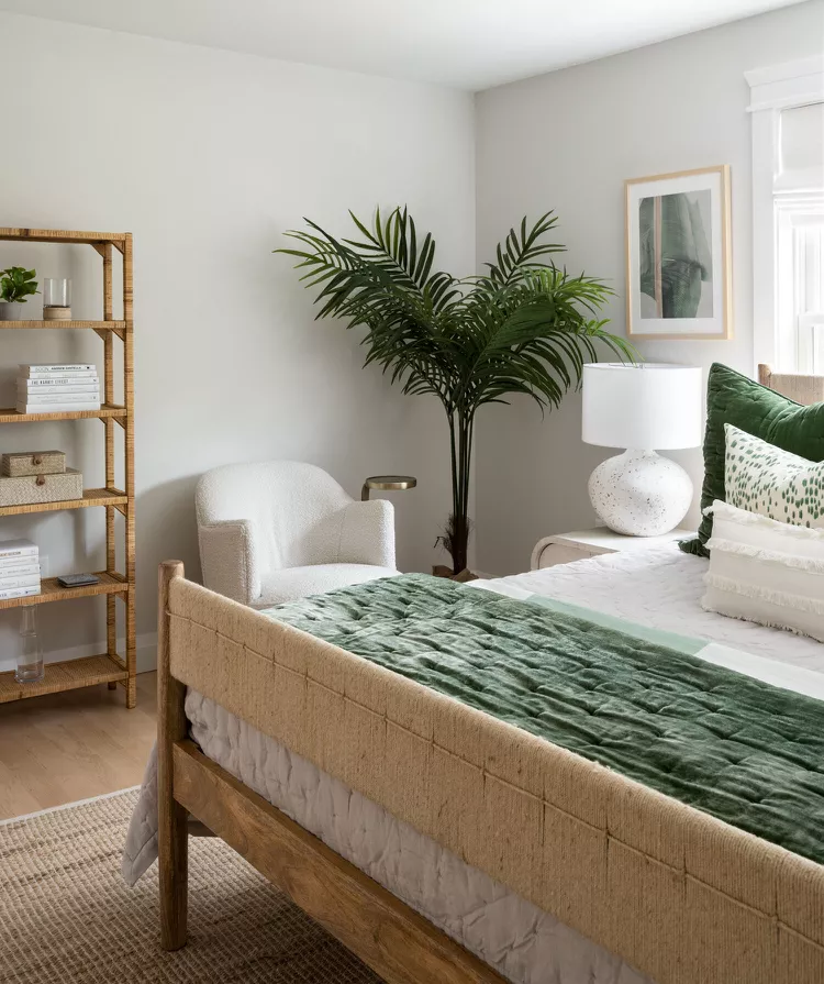
Earthy Greens and Beiges: Nature-Inspired Comfort
For those who find peace in nature, earthy greens paired with warm beige tones bring the outdoors inside. This color palette creates a soothing environment that feels grounded and restorative.
Primary Palette: Sage green, olive, and sandy beige.
How to Use It: Use green as an accent wall or incorporate it through textiles like bedding or curtains. Pair with beige walls, natural wood furniture, and greenery (think potted plants or dried florals).
Why It Works: Green tones are naturally calming and help connect the mind to nature, reducing anxiety.
Pro Tip: Layer different shades of green for depth, such as muted sage pillows alongside darker olive throws.
Source: The Spruce
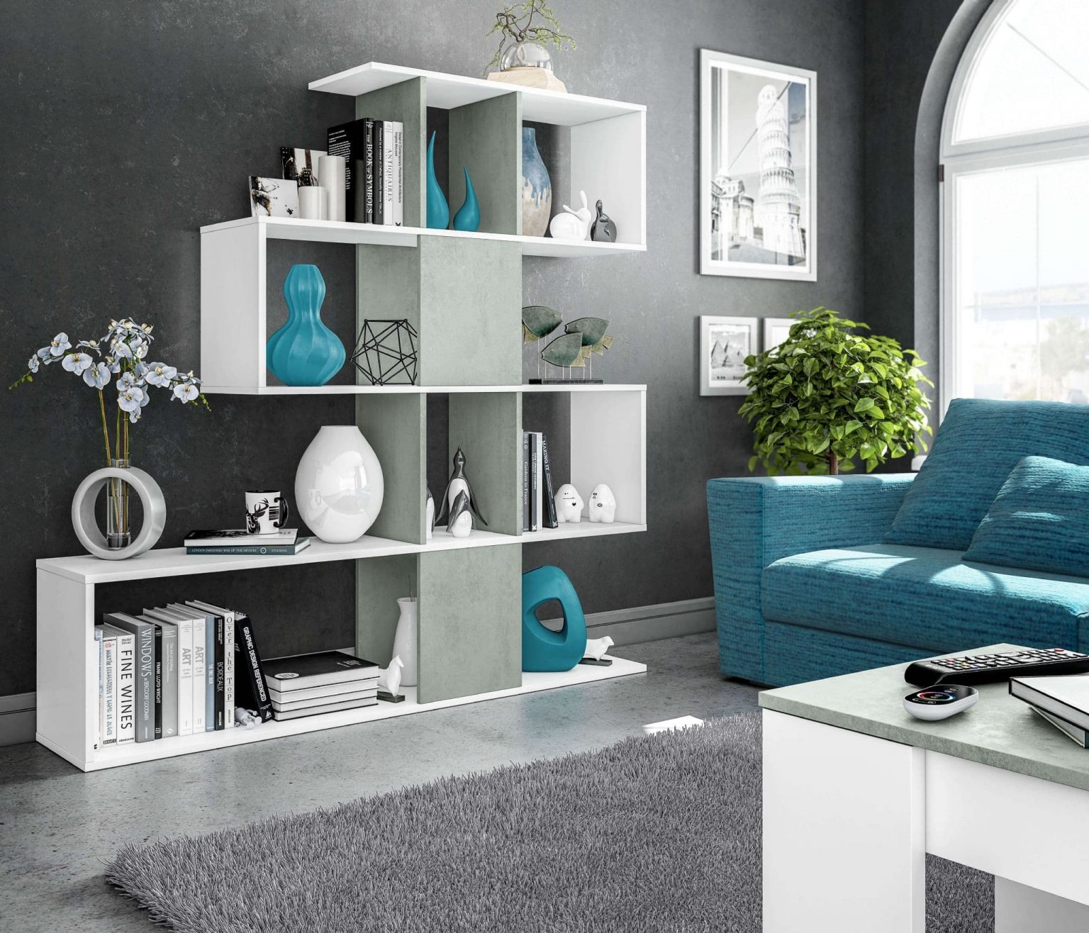
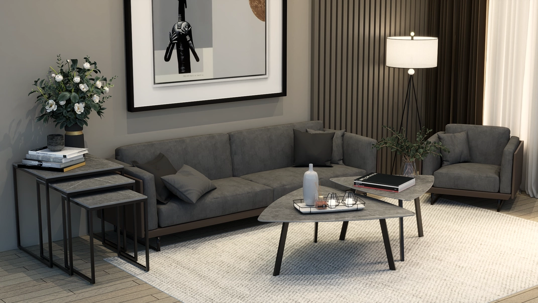
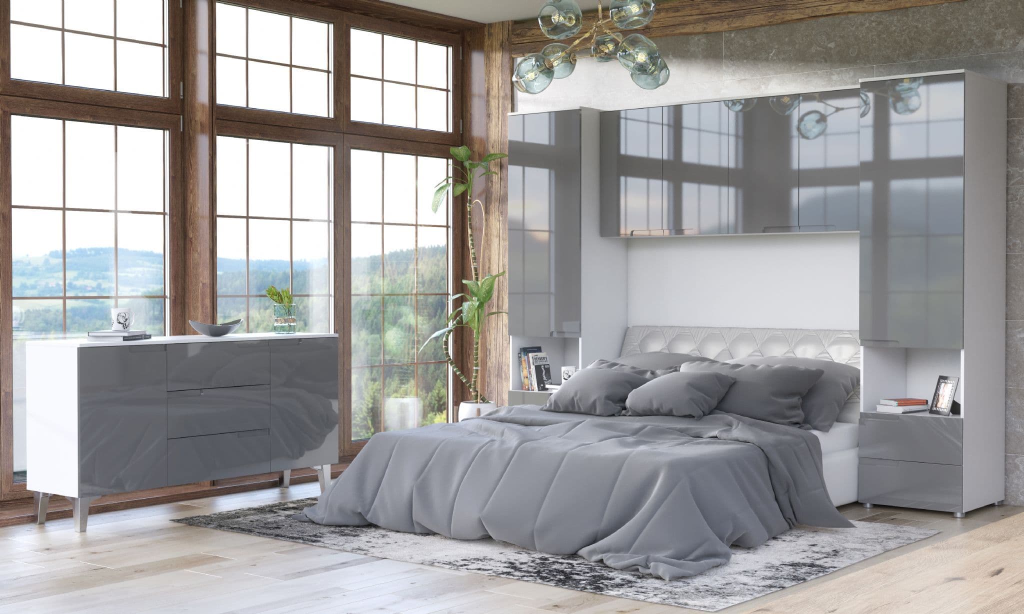
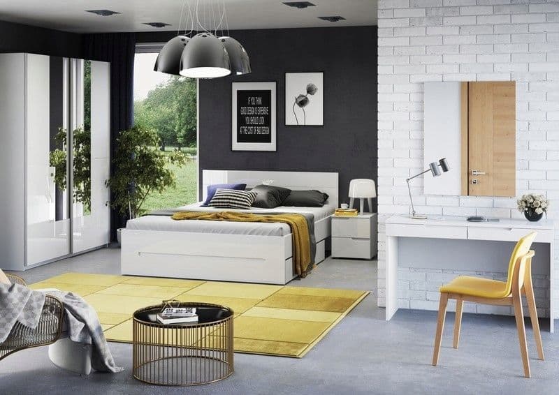
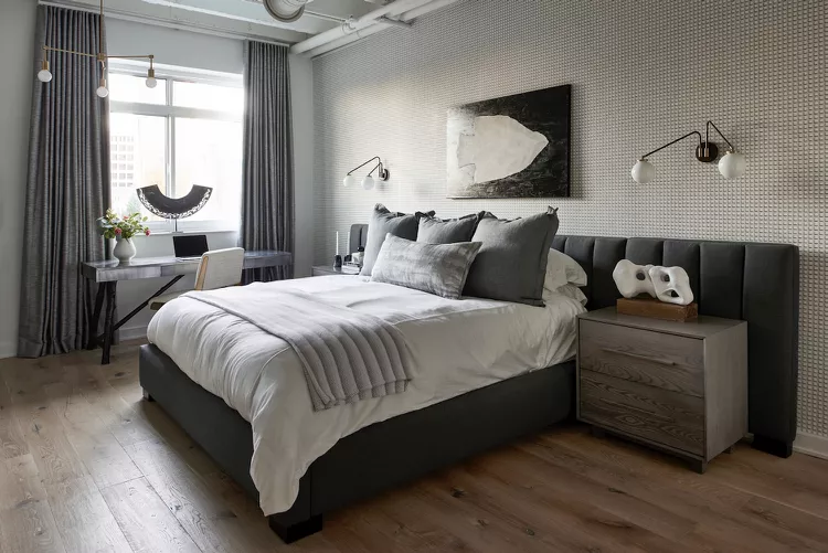
Warm Neutrals and Greys: Modern Minimalism
If you prefer a more modern aesthetic, warm neutrals and greys create a balanced and sophisticated bedroom. These tones exude understated luxury while maintaining a sense of calm.
Primary Palette: Light taupe, warm greys, and creamy whites.
How to Use It: Opt for grey walls with taupe or cream bedding. Incorporate black or metallic accents in lighting fixtures or decor for a contemporary edge.
Why It Works: Neutral tones are versatile, timeless, and promote a sense of spaciousness and clarity.
Pro Tip: Add layers of texture with a wool throw, knit cushions, or a plush area rug to keep the space cozy.
Source: The Spruce
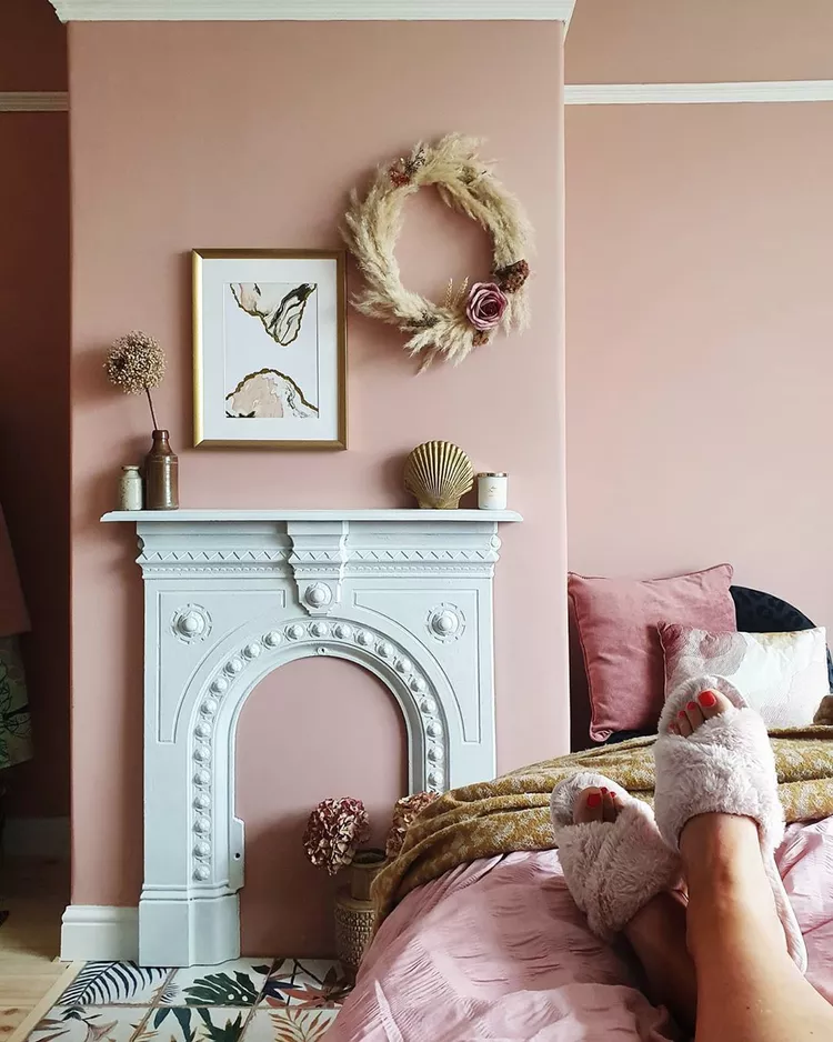
Muted Pinks and Whites: Subtle Serenity
Muted pinks, when done right, can feel incredibly soft and inviting. Paired with crisp whites, this palette creates a delicate, airy space perfect for unwinding.
Primary Palette: Blush pink, dusty rose, and pure white.
How to Use It: Use pink tones sparingly, such as in bedding, artwork, or a single statement wall. Keep white as the dominant color to maintain brightness and balance.
Why It Works: Subtle pinks bring warmth without overwhelming the senses, offering a fresh, calming vibe.
Pro Tip: Pair pink tones with light grey furniture or gold accents to elevate the look.
Source: The Spruce
Tips for Choosing Your Perfect Color Palette
Test Before You Commit: Always sample colors on your walls and observe how they look at different times of the day.
Start with What You Love: Your bedroom should reflect your style, so choose colors that make you feel most at ease.
Balance is Key: Mix neutrals with muted tones for harmony. Avoid overwhelming the space with overly bright or contrasting colors.
Add Layers: Incorporate layers of texture through bedding, rugs, and decor to soften and personalize the palette.
Styling with Accessories
Beyond walls, the right accessories can enhance your chosen palette. Consider soft throws, plush pillows, textured curtains, and decorative art pieces to tie everything together. For example, a grey bedroom color palette can be elevated with accents in soft blush or metallic gold for added warmth.
Bringing It All Together
The right color palette for a bedroom has the power to transform your space into a serene sanctuary. Whether you’re drawn to soft blues, earthy greens, warm neutrals, or muted pinks, the key is to choose tones that resonate with you and promote relaxation.
To complete your retreat, explore thoughtfully curated home accessories and furniture that complement your palette. At ShopHaus, we offer an array of pieces that will seamlessly enhance your space and bring your vision to life.
Designing a relaxing bedroom retreat starts with choosing the right colors. By selecting a calming color palette and layering it with soft textures and accessories, you can create a space that truly feels like a haven.
Ready to transform your bedroom? Explore timeless furniture and home decor at ShopHaus to bring your dream sanctuary to life.